

Overview
The Offer Performance Dashboard shows Key Performance Indicators (KPIs) related to the number of Offers issued in your loyalty program over time, the associated discount percentage applied from those Offers, and Offer redemption rates over time.
Access
To access the Offer Performance Dashboard, select Analytics from the top navigation bar, then select Offer Performance Dashboard from the side navigation menu.
Dashboard Details
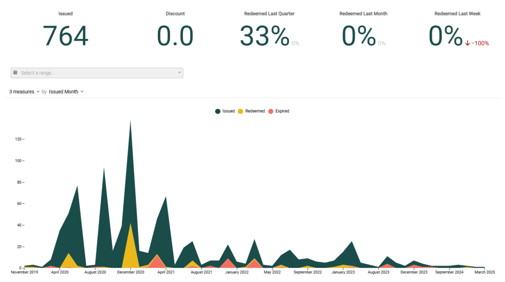
The following KPIs are displayed as a series of Tiles across the top of the Offer Performance Dashboard:
-
Issued: The total number of Offers issued within your loyalty program.
-
Discount: The discount percentage applied across Member orders from all Offers redeemed in your loyalty program.
-
Redeemed Last Quarter: The percentage of issued Offers that were redeemed in the last three months from the current date. Also included is the percentage of change in Offers redeemed, as compared to the previous three-month period.
-
Redeemed Last Month: The percentage of issued Offers that were redeemed in the last thirty days from the current date. Also included is the percentage of change in Offers redeemed, as compared to the previous thirty-day period.
-
Redeemed Last Week: The percentage of issued Offers that were redeemed in the last seven days from the current date. Also included is the percentage of change in Offers redeemed, as compared to the previous seven-day period
Beneath the KPI Tiles, the Offer Performance Dashboard displays a stacked line chart. This chart displays the trends of issued Offers, redeemed Offers, and expired Offers over the selected reporting period. If you hover your mouse over a point in the chart, the platform displays a pop-up with the exact count for that time period.
Beneath the combination chart, the Offer Performance Dashboard shows a pivot table. This pivot table displays a list of Offers by Offer Name, and their associated issued, redeemed, and expired counts, as well as the percentage of issued Offers that were actually redeemed.
Filter the Dashboard
The Offer Performance Dashboard provides a date range filter used to define the Dashboard’s reporting period. Optionally configure the following filter:
-
Date Range: Select Last Week, Last Month, Last Quarter, Last Year, or enter a custom date range by defining the start date and end date. The default filter selection is Last Year.
Configure the Combination Chart
Beneath the KPI Tiles, the Offer Performance Dashboard displays a stacked line chart that visually charts how Members are using Offers over time.
You can adjust the metrics that are included on the chart, and change the time period used to group data on the chart. Please note that the date range filter selected above is also applied to the chart.
-
Measures: By default, the chart shows the counts of Issued, Redeemed, and Expired Offers. Using the Measures menu above the chart, you can toggle any of these Measures off, which removes them from the chart.
-
Group by: By default, the chart displays counts By Month, with each point on a line representing a month. To change how data is grouped, select a different reporting frequency from the drop-down menu above the chart: By Month or By Week.
Configure the Pivot Table
The pivot table at the bottom of the Offer Performance Dashboard provides Offer usage details by Offer Name.
By default, the Offers are sorted by Offer Name in descending order. To change the sort order for the data in the pivot table, click the name of the column by which you want to sort. The platform sorts the table by that column in ascending order; click the column name again to toggle to descending order.

